Category: Uncategorised

  • Methods of Cataloguing — From Product Visibility to Visual Storytelling

    Project Development

    Week 1 ↗

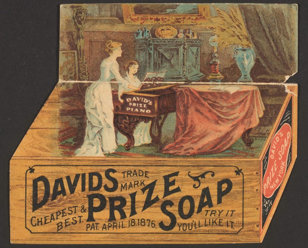
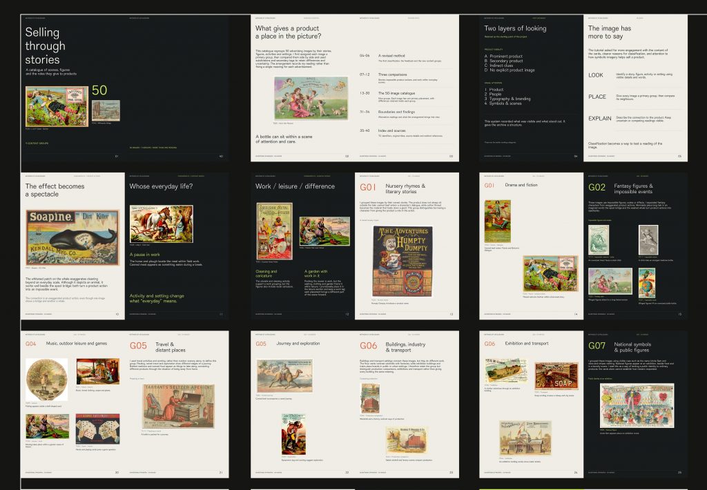
    Testing three ways to compare 26 trade-card images: grouping them by subject, sorting them by product visibility, and comparing originals with cropped details.
    Week 2 ↗

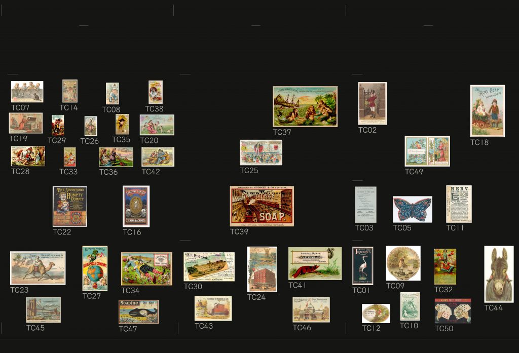
    Expanding the set to 50 trade-card images and arranging them in a grid to compare how clearly each product is shown and what draws the eye in each advertisement.
    After Feedback ↗

    In response to feedback, I regrouped 50 trade-card images by what they depict and brought the new groupings and comparisons together in a booklet.

    Written Response — Methods of Cataloguing

    What Belongs Together? An Inventory of Classification Criteria

    I examine the fourteen-part animal list that Foucault (1994) quotes from Borges in the preface to The Order of Things. So I regroup its entries according to the information they provide, and retain the original letter labels and paraphrase the entries below.

    1. Relations with people — a, c, g

    Animals owned by the emperor; tame animals; lost or homeless dogs.

    These entries describe animals through their relationships with people. One refers to ownership, another to behaviour towards people, and the third to being lost or without a home. I use these relationships as their shared basis for grouping.

    2. Bodily condition and behaviour — b, d, i, m

    Preserved bodies; piglets still feeding on milk; agitated animals; animals that recently broke a pitcher.

    These entries describe physical conditions, stages of life and actions. Because they include both lasting conditions and brief actions, I use a broad heading to bring them together for comparison.

    3. Imagined creatures — e, f

    Sirens; mythical animals.

    I group these together because both refer to imagined creatures. Sirens are an example of mythical animals, so the two entries overlap.

    4. Images and viewing distance — k, n

    Animals depicted with a fine brush; animals appearing fly-like from far away.

    These entries describe how animals appear to someone. I put them together to compare two conditions of seeing: how an image is drawn and how far away the viewer stands.

    5. Counting and listing — h, j, l

    Animals already covered by the classification; quantities beyond counting; et cetera.

    These entries concern what the list includes, how many animals there are, and what it leaves unnamed. The first can include all the other entries. The second gives no usable number. The third, “et cetera”, means there are other cases, but does not name them. I group these entries by what they say about the list’s contents and limits.

    The original list puts them one after another, with a letter beside each. But some describe who owns an animal, while others describe its condition or how it appears. I group entries that describe similar things together, so readers can see what they have in common and where they differ.

    References

    Foucault, M. (1994) ‘Preface’, The order of things: An archaeology of the human sciences. New York: Vintage Books. Available at: https://foucault.info/documents/foucault.orderOfThings.en/ (Accessed: 16 November 2026).
  • Methods of Iterating — From Image Settings to Thermal Paper

    Project Development

    Week 1 ↗

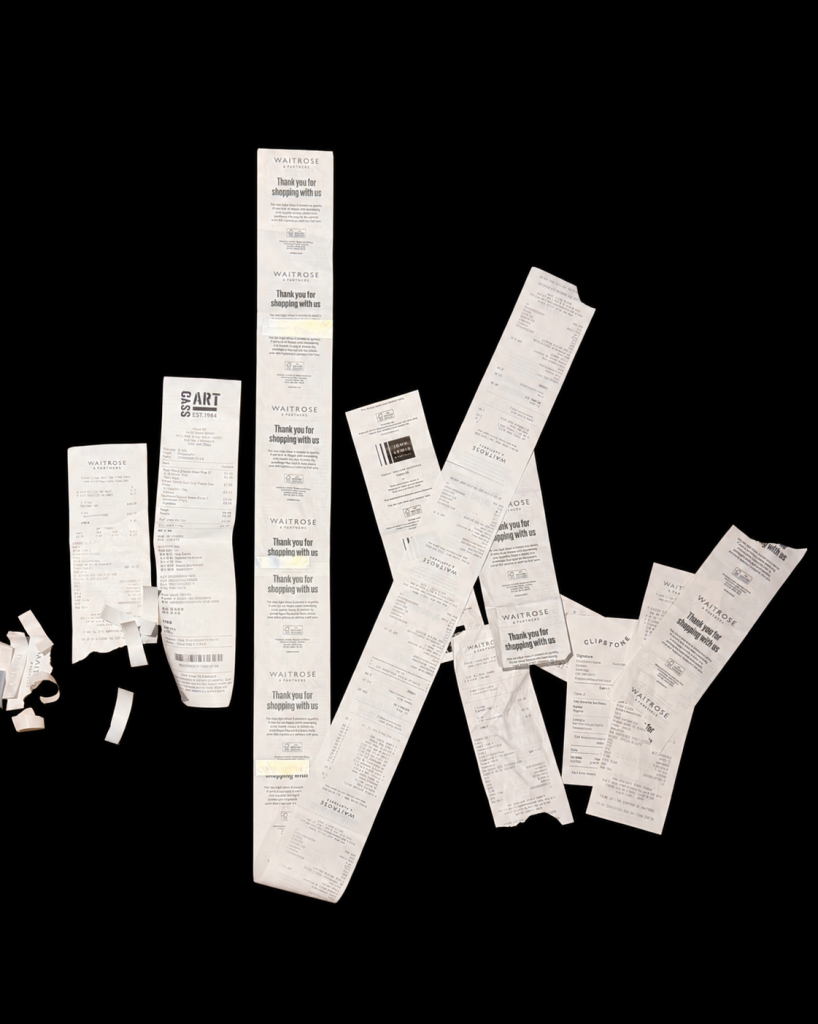
    Remaking Hanft’s receipt animation and testing thermal prints.

    Week 2 ↗

    Testing image treatments and assembling the butterfly animation.

    Week 3 ↗

    Varying treatments between frames and collaging thermal papers.

    Written Response — Methods of Iterating

    From Image Settings to Thermal Paper

    I began by remaking Adrian Hanft’s Moth in Flight on Receipts with a miniature thermal printer (Hanft, n.d.), extracting twenty frames from a butterfly video and lightening the background while keeping some background texture. By the 16 October tutorial, I had printed tests but had not assembled the animation. Screen detail did not reliably survive printing. I wanted to understand what made the image readable after this transfer.

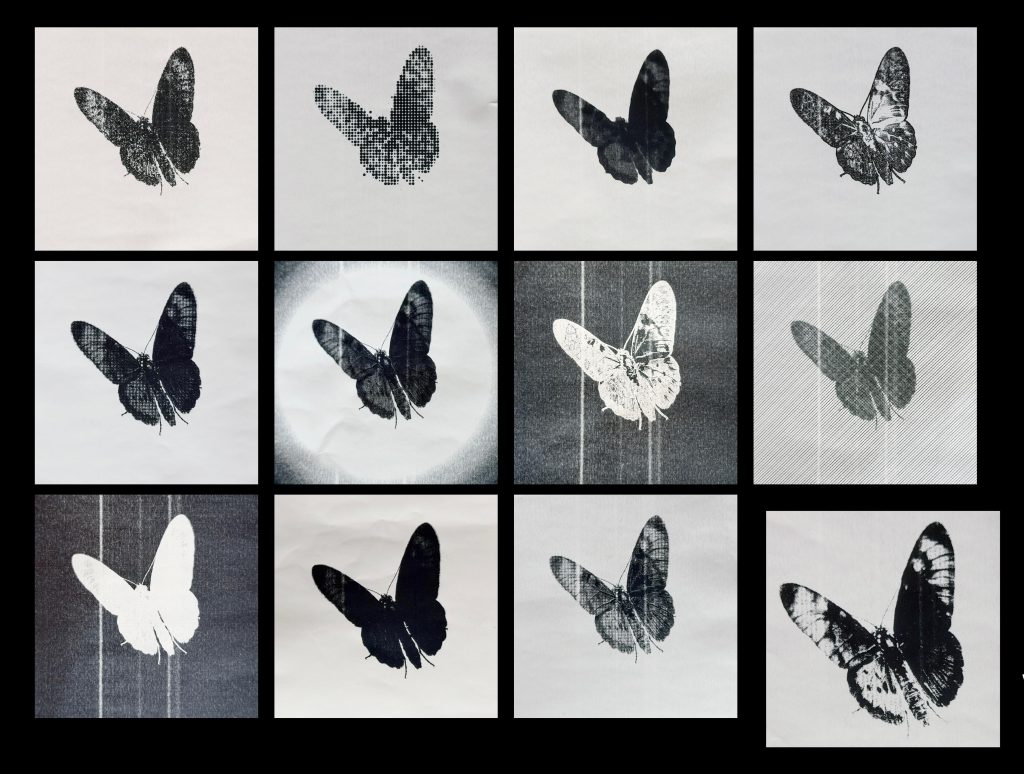
    For the 23 October tutorial, I dropped the background texture and used a butterfly video with a white background, extracting seven frames per second. My thermal printer prints only in black and white and cannot reproduce continuous grey tones, so I used dithering to simulate them through different densities of black dots. More dots make an area look darker; fewer dots make it look lighter. I then selected one of these dithered frames to test different print styles. I tested more than twenty Photoshop parameter combinations on this frame and presented twelve printed samples, including tonal adjustments, inversion and outline effects. I selected the setting that worked best, applied it across the sequence, photographed each printed frame and assembled the animation.

    Feedback on 23 October encouraged me to try a different image treatment on every frame. I tested this in a new twenty-frame spider animation. Queneau’s retellings of the same incident in Exercises in Style (2013, pp. 3–5) help me understand this shift from choosing one style to exploring variation. Yet in practice, applying a different treatment to each frame meant that both the subject’s position and its graphic style changed at once. I could not clearly distinguish how each contributed to the visual effect.

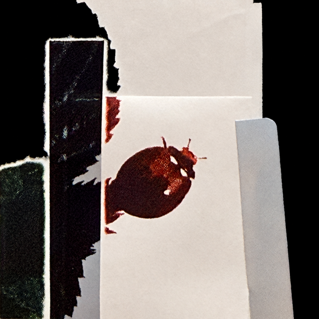
    When I ran out of receipts, I switched to thermal paper rolls for a twenty-eight-frame ladybird sequence. I used a roll that printed green as the base and pasted squares and strips of other thermal papers onto it. All looked white before printing; afterwards, the added pieces produced red, black and silver marks. Bolt describes “a knowing that arises through handling materials in practice” (2010, p. 29). She also argues that “materials are not just passive objects” (2010, pp. 29–30). I could choose the shapes and positions of the paper pieces, but their response to printing determined the colours. This made the paper an active part of how I constructed the image. I initially only needed a replacement for receipts, but printing revealed another way to alter the image. Choosing papers and placing cut shapes became part of image-making, alongside adjusting pixels in Photoshop. What began as a practical substitution expanded my tests from screen settings to the paper surface itself.

    References

    Bolt, B. (2010) ‘The magic is in handling’, in Barrett, E. and Bolt, B. (eds.) Practice as Research: Approaches to Creative Arts Enquiry. London: I.B. Tauris, pp. 27–34.

    Hanft, A. (n.d.) Receipt animations. Available at: https://adrian3.com/art/receipt-animation.html (Accessed: 3 November 2026).

    Queneau, R. (2013) Exercises in Style. Translated by Barbara Wright. Richmond: Alma Classics.

    Written Response — Drafts 1–3

    The full text of Draft 3 appears above; the PDF includes a photograph of its thermal-printed form.

  • Hello world!

    Welcome to myblog.arts. This is your first post. Edit or delete it, then start blogging!